
Thursday, November 25, 2010


Wednesday, October 20, 2010

Tuesday, October 19, 2010


Thursday, July 15, 2010
Institute of Mine Seismology - Logo Design *Freelance*
 Final Logo.
Visit/Contact IMS: http://www.imseismology.org/

Client choice for the Logo with different blues

Second Client presentation. IMS wanted a logo that has an educational research and monitoring look and feel.
1. Globe: The Globe speaks of education and the developed IMS font hints at graph monitoring. Fun and modern.
2. Fold: A font designed to illustrate how easy rock can fold under earthquake pressure. Speaks of modern, advanced technology.
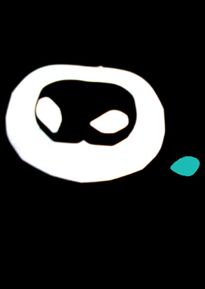
3. BlackDot: It has a raw planet-like feel of a dark, curious space thats volatile. This is an illustration of movement of how the rock tears during an earthquake in different directions.
4. Rock: This takes the viewer to the source of seismic activity, i.e the rock as focal point. The choice of font suggests higher learning.


Monday, May 10, 2010
Evita Bezuidenhout, Kossie Sikelela Cook Book - mr DESIGN, *Freelance*

Cover & Content Photoshop & DTP

Tuesday, March 9, 2010
ANVIL IP Corporate Identity, mr DESIGN *Freelance*
 ANVIL IP is an Internet Tele/Video Communications Company and wanted to have an identity that resonates its functions and be on a similar level to Skype. Anvils are also cumulonimbus clouds (high horizontal clouds).

Monday, March 8, 2010
UNESCO - Make Culture Count Poster Competition Entries

Blood Brothers.
With reference, that of when two friends cut their palms and touch each other's hands so that their blood can mix. To seal their bond and thus become blood brothers. The idea is that although we are different, people are people everywhere and we bleed the same blood.

Rock Not Cock.
Dictionary: cock- a firing lever in a gun which can be raised to be released by the trigger. Music is the one medium that we all respond to and the poster is to emphasize that music is a stimulation that unites us. Make music not war.
Wednesday, March 3, 2010


Subscribe to:
Posts (Atom)


-
 Molly Maid suggests that clients build a relationship with a "regular" Molly to establish confidence and trust, but have a second ...
 -
 Final Logo. Visit/Contact IMS : http://www.imseismology.org/ Client choice for the Logo with different blues Second Client presentation. IMS...